Subscribe For Free Updates!

We'll not spam mate! We promise.

Simple Blogger Tips and Tricks For Traffic

Simple Blogger Tips and Tricks For Traffic

Blogging becomes a huge new phenomenon now because many people out there wants to make money simply from blogging. If you are one of these peoples, to make money from your blog you need to drive web traffic to it. Here's how to attract traffic in two hidden tricks no one will told you.


Trick 1: Publish only good contents all the time.
What actually a good content is? It has many different meaning for different bloggers.
However, the main criteria of a good content are the one that makes people feel good. So if you are a blogger, you need to write your blog post to make your reader feel good.
You need to learn the skill. To make you professional in performing that skill, you need to practice consistently. Please take an hour or two polishing your skill in writing original good contents.
The good factor used as a start is to produce a lot of how-to articles.


Trick 2: Drive targeted traffic from top 3 sources only.
The top three sources are article marketing, blog commenting and forums. You need to become highly active in doing all three.

During your initial months of blogging, do not use any other way to promote your blog. Just focus on previous threes sources I told you before. When done with a focus, the result will make you happy.

Sign up for a free account in top article directory. They have certain rules but if you follow to rules and you always produces good article, you can get more traffic when people click on your profile in the resource box.

Become the first reader to give comment in any new posts in the blogs you loyally followed. You will get more traffic to your blog when many readers click on your name in the comments box. It will add number of incoming links to your blog too, thus helps your blog to build good page rank at the same time.

Super-Lightweight Drone Autonomously Avoids Obstacles

The age of commercial and private drones is upon us, exemplified by increasingly common stories of drone mishaps and even the likes Amazon announcing plans to launch a drone delivery service in the coming years.
But there may not always be enough handlers trained or available to control all the varieties of drones making their way into the skies, so one team from the Netherlands developed a lightweight unmanned aerial vehicle (UAV) that can traverse the skies on its own.
With a 28-centimeter wingspan and weighing just 20 grams (about the weight of four sheets of paper), the DelFly Explorer uses a small stereovision system, composed of two cameras and a tiny embedded computer, to avoid obstacles in its path.
SONY DSC

The stereovision system (which weighs just 4 grams) allows the DelFly Explorer to determine the distance between it and any flight barriers in its environment in real-time.
In the presentation video, the DelFly Explorer’s creators envision the device being used for reconnaissance missions in emergency situations and even during concerts to allow for innovative video shoots.
stervisio087adfs

However, at present, there are no plans to try to bring the DelFly Explorer to the commercial market. Instead its creators are focusing on further developing the capabilities of the device.

Apple Announces Top iPhone, iPad Apps of 2013


App_store-1

Finishing the year atop Apple's App Store list has never been more competitive. The company announced in October that the App Store features more than one million apps that have combined for more than 60 billion total app downloads.
So, what does it take to reach the top? Apparently lots and lots of candy.
Candy Crush Saga was a star for iOS users in 2013, taking the top spot as the most downloaded free app on both iPhone and iPad this year. The addicting game was also the top grossing app on both iPhone and iPad, an impressive feat considering the app is free and relies on in-app purchases for revenue.
Candy Crush officially earned its crown Monday when Apple released its annual list of the top downloaded apps. The company does not break out specific download figures, but it did reveal a "Top 10" list for multiple categories, including top paid iPhone and iPad apps. Minecraft - Pocket Edition took the top spot on both devices in the paid app category.
Examining the lists for both devices gives a slightly better picture of how users are engaging with iPhones and iPads. Social media sites, for example, were some of the most downloaded apps on iPhone, but only one, Facebook, even cracked the top 10 on iPad.
Twitter, the company behind the year's most highly anticipated tech IPO, did not appear in the Top 10 on any list. Vine, the video sharing app Twitter unveiled in January, was #4 on the Free iPhone Apps list.
Snapchat, the photo-sharing app that automatically deletes images and videos after a recipient views them, was downloaded more times than Facebook and Instagram.
Based on the lists below, it appears as if iPads are primarily used for game playing — and gambling. Five of the top 10 highest grossing apps on the iPad in 2013 were gambling-related, including DoubleDown CasinoBig Fish Casino, and Slotomania HD; the other five were games.
Last year's most popular free apps for iPhone and iPad — YouTube and Skype for iPad, respectively — were both in the top five again this year.
Here's a look at the apps that kept us glued to our iOS devices in 2013.

Top iOS Apps of 2013

Top Free iPhone Apps
Top Free iPad Apps
Candy Crush Saga
Candy Crush Saga
YouTube
YouTube
Temple Run 2
Temple Run 2
Vine
Calculator for iPad Free
Google Maps
Skype for iPad
Snapchat
Netflix
Instagram
Despicable Me: Minion Rush
Facebook
iBooks
Pandora Radio
Facebook
Despicable Me: Minion Rush
The Weather Channel for iPad
Top Paid iPhone Apps
Top Paid iPad Apps
Minecraft - Pocket Edition
Heads Up!
Pages
Temple Run: Oz
Temple Run: Oz
Angry Birds Star Wars
Plants vs. Zombies HD
Plague Inc.
Angry Birds Star Wars HD
Afterlight
Notability
Free Music Download Pro - Mp3 Downloader
Angry Birds Star Wars II
Bloons TD 5
iMovie
Sleep Cycle alarm clock
The Room
Plants vs. Zombies
Bad Piggies HD
Top Grossing iPhone Apps
Top Grossing iPad Apps
Candy Crush Saga
Candy Crush Saga
Clash of Clans
Clash of Clans
Pandora Radio
Hay Day
MARVEL War of Heroes
DoubleDown Casino
Hay Day
Big Fish Casino
Big Fish Casino
Modern War
The Simpsons: Tapped Out
Bingo Bash HD - Free Bingo Casino
Modern War
The Simpsons: Tapped Out
Kingdoms of Camelot: Battle for the North
Slotomania HD - FREE Slots
The Hobbit: Kingdoms of Middle-earth
GSN Casino

Smartphone App Uses Selfies to Check Your Cholesterol Level

App

A team of engineers has designed a smartphone accessory and app that allows users to monitor their own blood cholesterol levels. Think of it as a sort of cholesterol selfie — or maybe a healthie?
As researchers from Cornell University explain in a paper in the journal Lab on a Chip, all you need — aside from their attachment and a smartphone — is a reagent test strip and a willingness to draw your own blood. Cholesterol tests tend to rely on reagent strips that turn different colors, depending on the cholesterol levels of the blood placed on them. The researchers’ achievement was to design an attachment to be placed over the smartphone flash and camera that can illuminate and capture the color of the strip, rendering unnecessary specialized equipment or an in-person health professional. The lab is working on a smartphone app that can determine vitamin D levels, too.
The technology is relatively straightforward, and the research group is one of many developing smartphone tools such as these. Already, apps can turn smartphones into heart-rate monitors,sleep monitors or ultrasound machines, to name just a few. According to the U.S. Food and Drug Administration, half of the more than 3.4 billion smartphone and tablet users worldwide will have downloaded mobile health applications by 2018.
Whether they use them regularly is another question. Still, the continuing spread of smartphones globally and the determination of health policymakers to drive down costs make such cheap, idiot-proof (at least, idiot-resistant) technologies all-but inevitable.

Apple's New Mac Pro Goes on Sale Dec


Apple-mac-pro
Apple's new Mac Pro will be available to order starting on Thursday, the company announced on Wednesday.
The oval-shaped desktop machine for professionals will start with a 3.7GHz, quad-core Intel Xeon E5 processor, dual AMD FirePro D300 GPUs with 2GB of VRAM each, 12GB of memory and 256GB of PCIe-based flash storage — with a price tag of $2,999.
More demanding users can opt for the 3.5 GHz 6-core Intel Xeon E5 processor with Turbo Boost speeds up to 3.9 GHz, dual AMD FirePro D500 GPUs with 3GB of VRAM each, 16GB of memory and 256GB of PCIe-based flash storage, starting at $3,999.
If you really need a powerful machine, upgrade to the 8-core or 12-core Intel Xeon E5 processors, AMD FirePro D700 GPUs with 6GB of VRAM, up to 64GB of memory and up to 1TB of PCIe-based flash storage.

Why 'Time Spent' Is One of Marketing's Favorite Metrics

Time is money. Time is the enemy. Time is on your side.
We talk a lot about time, but the one thing we definitively know about time is there's never enough. For a marketer, that means you're going to have to work hard to get a minute or two from a consumer. You need to earn it, so if your site can garner a high time spent, pat yourself on the back for a job well done.
"Time spend is not a very actionable metric, it's more a sign that you've done the right thing," says David Marks, VP of product at StumbleUpon, whose average session length is an impressive 30 minutes for women, 22 minutes for men. Marks attributes the site's high time spent to the experience on StumbleUpon. "There are many reasons why people come to StumbleUpon, but a lot of it is focused around inspiring them, surprising them, entertaining them with unexpected content," he says. When users are browsing a category, they see hundreds of things they've never seen before that are very high quality about a specific topic of interest. "It's all about the experience, and a lot of it just holds people's attention," he says.

How Time Spent Is Earned

Marks says the StumbleUpon team pays a lot of attention to the very first user session, which correlates to how often users come back and how well the site retains them. "The longer that first session is, the more likely the user is to be happy and refer us to friends — it's a great predictor of how things are going," he explains.
But for StumbleUpon, that means the site needs to hit a home run on the first swing. Three things help determine how much time a consumer will spend on-site, the first time and any time thereafter — specifically for StumbleUpon, but also applicable to any content site — are:
  • Do I care about this?
  • Should I care about this?
  • What's the quality of content?
stumbleupon mars
StumbleUpon results for a search of "Mars"

One element that can't be overlooked when analyzing time spent is a site's organization and design. "The better the content and site organization, the longer users will want to spend on a site," says Jason Squardo, EVP of optimization at ZOG Digital. More time on-site means more engagement, which indicates a greater likelihood to purchase, sign up and share the content.
Time spent should be monitored along with bounce rate and pages per visit — knowing where users are spending more time and where they're bouncing means you can make real-time tweaks to optimize engagement. "While bounce rate is a great tool for identifying pages that are severely underperforming, time spent offers another angle by showing you how long users are spending on your site before moving on," says Jordan Bell, marketing manager at Advertise.com.

What Time Spent Can Teach You

Time spent also indicates user satisfaction. Unless you're masochist, you're not going to spend time engaging with a site if you're not enjoying it. The digital team at Discovery Communicationshas made the most of this idea. After several one-off live animal camera events with impressive time-spent results, like Shark Week's Shark Cam, the team launched Animal Planet L!VE in April 2013. The site is a digital destination for "ambient entertainment" with more than 20 streams of animals, from kittens to reindeer, and streams are viewable via AppleTV and on Roku, Samsung Smart TVs and Xbox. "The addictive, unfiltered content has spawned new cams and set a high bar for future products, with visitors averaging more than 12 minutes in the simple but engaging experience," says Stephanie Fried, VP of digital insights and marketing at Discovery.
Of course, Animal Planet L!VE is primarily a desktop activation, and most consumers won't stream long videos like these on their mobile devices. And that's key to think about when analyzing time spent — the statistic can be different across different platforms, and even across devices on the same operating system, says Marks. People using an iPhone are going to have a different time on site than people using an iPad, and Android users actually spend 15% more time per page on StumbleUpon than iOS users. More broadly, mobile stumbling sessions are 13 minutes, much shorter than the site-wide average of 30 minutes (meaning desktop stumbling is closer to 40 minutes), since mobile is usually on-the-go, such as when people are commuting or waiting at a doctor’s office. That said, if you want to increase time spent for all of these variables, you have to research into the habits of users on various devices and platforms and optimize for that.
You can't "disentangle" product design from engagement and user experience — they hinge on one another, says Marks.

How Much Is Too Much?

Time spent is clearly a handy metric for interactive products (i.e. a game or choose-your-own-adventure piece) or content sites, but some businesses actually focus on cutting downtime spent. Take, for example, an ecommerce site. If a user has items in the shopping cart, the company will want to focus on making the shopping experience faster and more efficient, says Christopher Penn, VP of marketing technology at SHIFT Communications. He cites a statistics from Amazon, which said back in 2007 that every 100 milliseconds of latency — time when a customer is waiting for something to load — represents a revenue loss of 1%. (Similarly, then-Googler Marissa Mayer had said "Users really respond to speed.") So while content wants to suck the audience in, microsites and landing pages often want to focus on reducing time spent on a page. Because once the user discovers the desired action.

Ask a Dev: Should Every Website Have an App?

If you want to build an app, one of the first questions you should ask yourself is whether to build it on the web or "go native," meaning write it specifically for iOS or Android.
Ask a Dev Should Every Website Have an App

Our developer this week, Jake Riesterer, says the best performance is likely to come from designing the app with a particular operating system in mind. Both iOS and Android provide frameworks to make writing the app easier; your app will probably look better than anything designed through the web because you can use the graphics processing unit that comes with the hardware Android and iOS devices use.
If you go the web route and use web graphics library, a type of JavaScript that lets you render 3Dand 2D graphics with any compatible browsers, web tools might be right for you. But Riesterer cautions that web graphics library isn't compatible with iOS devices.
But let's backtrack — do you need to build an app at all? Depending on your user base, a mobile site may be sufficient.
If you already attract a lot of traffic to your mobile site, an app might not be worth the trouble. But apps are great for discoverability, and if you want users to get to your brand quickly, it could be worth it, Riesterer says.
Our developer experts are from Mutual Mobile, a leading development and design firm that builds mobile strategies for top companies such as Audi, Google and Citigroup. The team is eager to answer your questions about mobile, so ping us with your top queries on Twitter, using the hashtag #AskaDev. Don't forget to check out our Ask a Dev YouTube channel and subscribe.

Pebble Update Adds 'Do Not Disturb' Mode

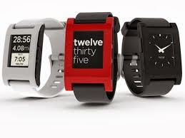
Pebble smartwatch
The Pebble smartwatch just got a nice update that offers a "do not disturb" mode and better support for notifications and alarms.
The update comes just a month after Pebble received a major overhaul for iOS 7 users, including full notification support.
The new update tweaks iOS performance, sending notifications more quickly from iOS to the Pebble. The update also improves how notifications work on the smartwatch. You can now easily choose if you want to receive all notifications on your smartwatch, just phone calls or turn notifications off.
This notification control plays well with the biggest feature, a new "do not disturb" mode that lets users set a period of time when notifications will be off. This is great for people who sleep wearing a watch and don't want to be roused by a vibration on their wrist. As someone who sleeps with my Pebble on a nightstand, the vibrations in the middle of the night can still be a nuisance, so this is a great new feature.
Pebble also improved its alarm app and now you can create multiple alarms, toggle an alarm to be on or off and edit existing alarms. There's also a new "snooze" alarm, for people who want to put off dealing with their alarm.
To update to the latest version of the Pebble firmware, just open the iOS or Android app and click the update button when prompted.

Google Tips Helps You Do Cool Stuff With Google Products

Google has launched Google Tips, a website with a smorgasbord of helpful tips and less-known features of various Google products.
Google Tips Helps You Do Cool Stuff With Google Products

The site is a very simple affair, consisting of rows of cards with helpful tips, which range from setting up Gmail on your mobile phone to grabbing your customized birthday Doodle.
You can sort the tips by topic or by category such as "On the go," "At home" or "At the office" by clicking on the menu button in the upper left corner.
Power users will likely be familiar with most of the included tips, but the site does contain a fair amount of obscure tricks, such as setting up an Android device to act as a pedometer.
Have something to add to this story? Share it in the comments.

Microsoft Sets Dates for Build 2014 Developer Conference

Microsoft Sets Dates for Build 2014 Developer Conference
Microsoft formally broadcast the dates for its three-day Build 2014 developer seminar. It will take location from April 2 to 4 at San Francisco's Moscone Center.

This will be the second consecutive construct held in San Francisco, a move the company made last year in a attempt to cultivate more developer interest in Windows 8. construct seminars in 2012 and previous years were held in Microsoft's dwelling territory of Redmond, clean.

Microsoft is furthermore booting off developer season early this year. By holding construct in early April, it will likely arrive before Google I/O, BlackBerry Live and Apple's WWDC. No designated days have been set for those other conferences, but they normally begin in late April or early May.

Microsoft utilised Build 2013 to display off many of the characteristics of Windows 8.1, which shipped this drop, and the business broadcast several big-name apps would be coming to the platform, encompassing Facebook, Foursquare and Flipboard.

In 2014, we'll probably see more about the next iterations of Windows, most expected called Windows 8.2 and rumored to have the code title "Threshold." numerous users have called for a complete come back of the start menu in the desktop; the present button, reintroduced in Windows 8.1, only takes users back to the start computer display. It will be intriguing to glimpse if Microsoft brings back on vintage characteristic one time again to appease users that aren't yet warmed up to the new, touch-friendly up to date UI.